Crafting Magic
Designing a Basement Bar: Inside Our Dark and Moody Hotel Concept
Basements are the rooms most people give up on. No windows, low ceilings, awkward columns in the middle of the floor. In hospitality they get handed the jobs nobody else wants, so they end up as storage, or a second dining room nobody books.
We think that is a waste of the best room in the building.
This concept came out of a question we keep coming back to in the studio: what would we do with the lower level of a busy executive hotel if the brief was simply to make guests want to stay downstairs? Not a function room. Not overflow covers. A proper private bar, the sort of place you end up in for a nightcap and stay in for two.
Here is how we approached it.
Lean into the dark, do not fight it
The instinct with a basement is to brighten it. Pale walls, white ceilings, as much light as the electrics will carry. It almost never works. You end up with a room that reads as a basement pretending to be a ground floor, and guests feel it even if they cannot name it.
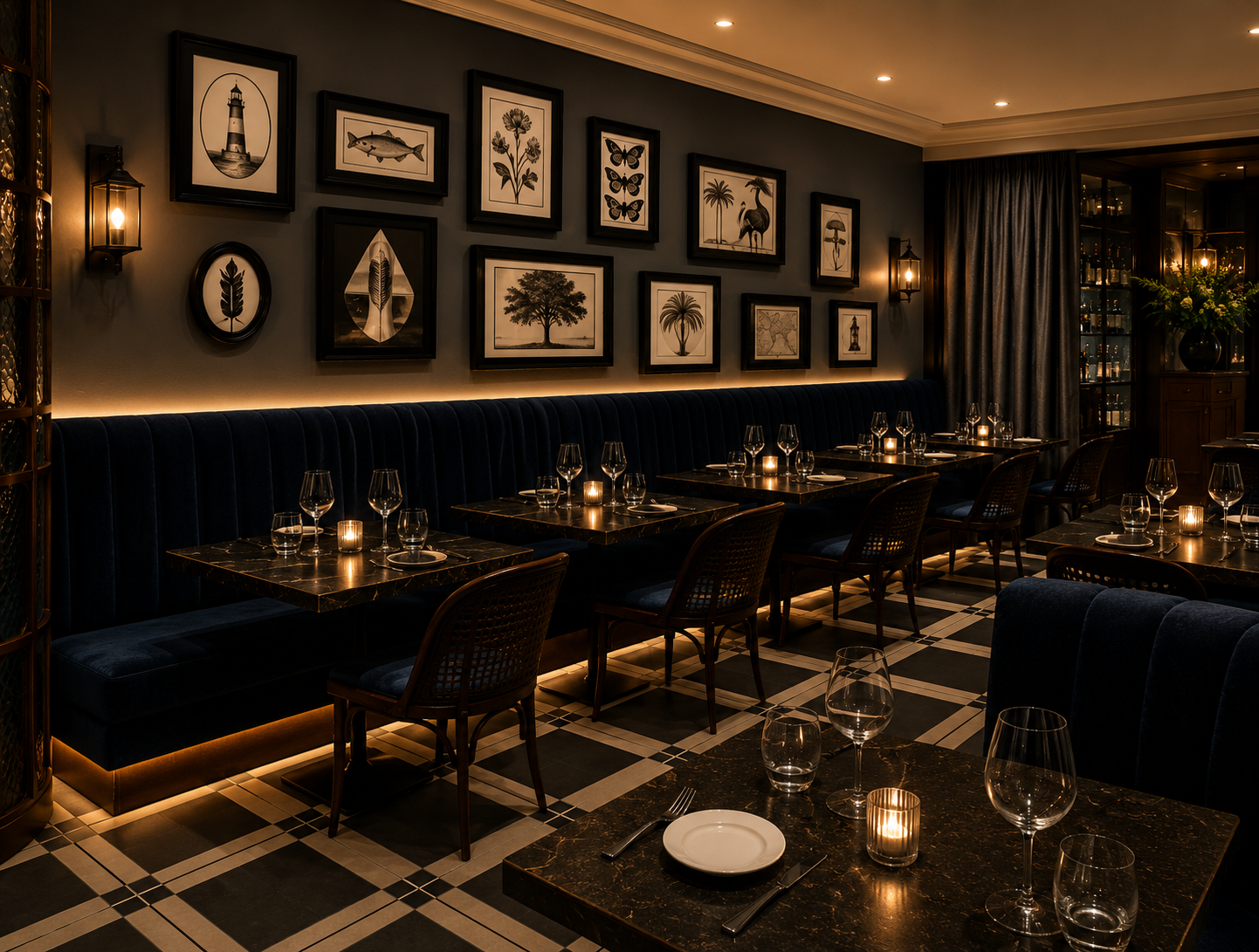
We went the other way. Navy walls, dark timber, black joinery, a monochrome floor. The room admits what it is and turns that into the selling point. A windowless space with no natural light is the only kind of room that can hold its atmosphere at four in the afternoon and at midnight, and that consistency is genuinely useful for a hotel bar that needs to trade across a long day.
The colour scheme does a second job too. Dark surfaces absorb rather than bounce, so the light you do add has to be deliberate. Every glow in the room is there because somebody chose to put it there.
Light in layers, never from above
The single biggest mistake in basement hospitality design is lighting a room from the ceiling and calling it done. Downlights flatten everything. Faces look tired, food looks grey, and the room feels like a corridor.
This concept works on four layers instead.
Concealed LEDs sit behind the back bar shelving, so the bottles themselves become the brightest thing in the room. It is an old trick and it still works, because it draws the eye to the part of the bar that is doing the selling.
Low pendants hang over the bar counter at a height that puts a pool of light on the surface and leaves the ceiling in shadow. Black outer shades with a warm metallic interior keep the glare off guests and throw the light down where it is wanted.
Spotlights pick out the artwork on the banquette wall, so the gallery run reads clearly without lifting the general light level.
And then candles on every table. Nothing else gives you that quality of light, and nothing else makes people lower their voices and stay longer.
The result is a room with bright spots and dark spots rather than an evenly lit box. That variation is what makes a space feel intimate.
Give people a reason to look around
A windowless room has no view, so you have to build one. On the banquette wall we ran a dense gallery of framed botanical and entomological prints, black frames on a dark ground, lit from above. It gives the eye somewhere to travel, it fills a long wall that would otherwise feel like a tunnel, and it gives solo guests something to look at that is not their phone.
The back bar does the same job in the other direction. Backlit shelving, glassware catching the light, brass detailing picking up the warmth. It is the anchor of the room and it earns the attention.
Materials that take a beating and still look expensive
Hospitality interiors live or die on the second year, not the first. Everything in this concept was chosen with that in mind.
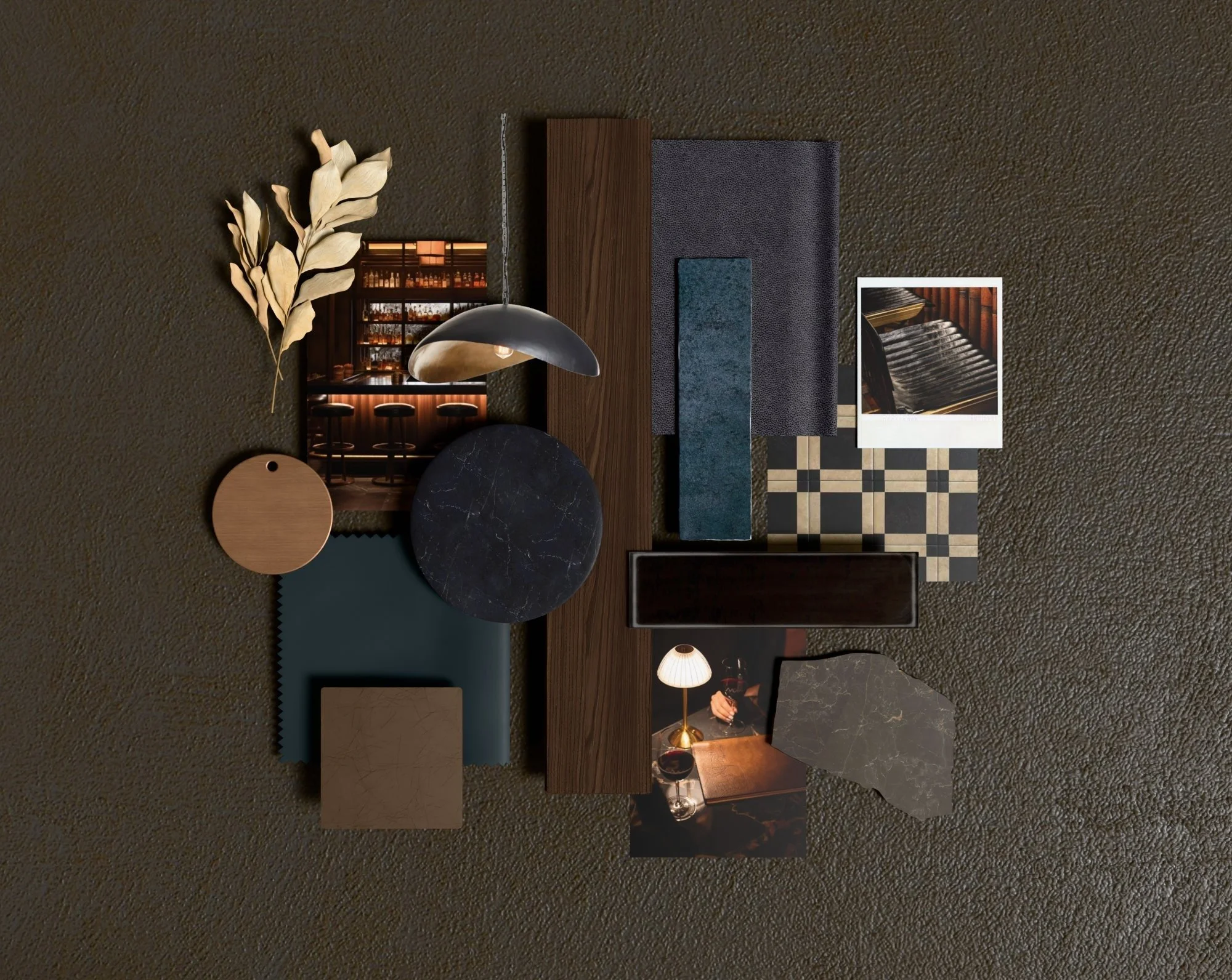
Ribbed navy tile to the bar front, because it hides scuffs and adds texture at the exact height where people kick. Dark stone tabletops that will not show a ring. Leather seat pads on the bar stools rather than fabric. A checkerboard floor in dark tones, which reads as classic, disguises traffic, and gives the room a graphic backbone that stops all the navy from turning into mush.
Brass hardware throughout, warm rather than polished, because it patinates instead of degrading.
Design for the solo guest
The commercial thinking behind this one is worth spelling out. Executive hotels are full of people travelling alone. Those guests will happily spend money on a good glass of wine and a quiet hour, and most hotel bars make it slightly uncomfortable to do so.
A long bar with proper stools and good sightlines lets a solo guest sit without feeling on display. Banquette seating along the wall works for the same reason, since sitting with your back protected and the room in front of you is far more comfortable than a table in open floor. Low light, close tables and a bit of noise cover mean nobody is performing.
Get that right and the bar stops being an amenity and starts being a reason people book the hotel again.
The takeaway
Dark, moody spaces are not about restricting light. They are about controlling it. If you are working with a basement, a windowless back room or any space that feels like a problem, the answer is usually not more brightness. It is better contrast, warmer materials and a clear idea about who is meant to sit where.
FiFi Interiors is a hospitality and commercial interior design studio working with hotels, restaurants and bars across the UK. If you have a difficult space and no idea what to do with it, that is generally our favourite kind of brief.