Crafting Magic
Behind the Moodboard: Designing a Speakeasy-Inspired Private Members' Club
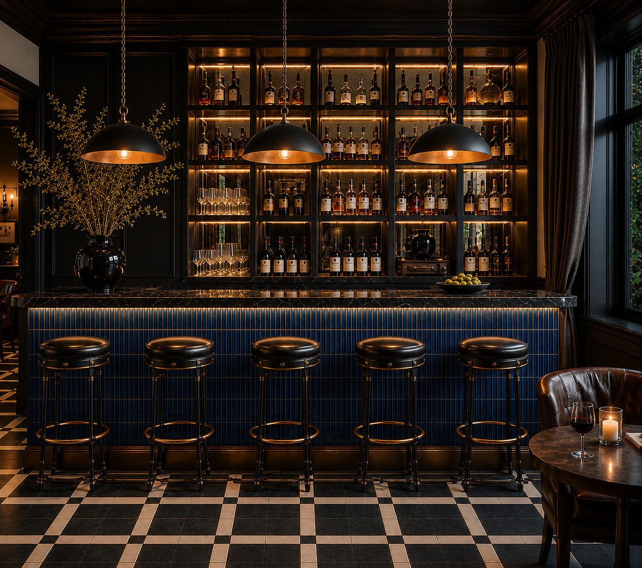
Late nights, low light and a touch of glamour. We are currently developing a new private members' club concept, an intimate and atmospheric space drawn from the world of hidden bars, speakeasies and after-dark hospitality.
There is something irresistible about an interior that reveals itself slowly.
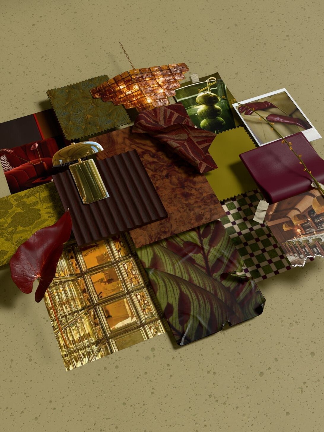
For this concept we are moving away from the bright and the expected and towards something considerably richer. Deep colour, tactile materials, pools of warm light and just enough glamour to make the space feel indulgent.
The brief centres on a members' club interior that reads as intimate and exclusive without becoming formal. Somewhere you settle into a corner with a cocktail, lose track of time over dinner, and stay long into the evening because leaving stops occurring to you.
Creating a modern speakeasy interior
Our starting point was the atmosphere of a classic speakeasy. Low lighting, intimate seating and that slightly secretive feeling of finding somewhere you were not necessarily supposed to find.
We are taking those ingredients and giving them a contemporary, design-led identity, so the space carries the mood of a speakeasy without dressing up in costume.
Burgundy and oxblood leathers sit alongside olive green textiles, burl walnut, fluted timber panelling and boldly patterned botanical fabrics. Glossy and reflective surfaces run throughout to catch the light, while flashes of brass and amber warm the deeper tones. Checkerboard flooring in green and burgundy grounds it all with a graphic, faintly retro note underfoot.
The effect is layered, intoxicating and a little unexpected.
A material palette made for after dark
Most interiors are designed to be seen in daylight. A members' club is not one of them, so we worked backwards from the lighting conditions.
We have deliberately combined finishes that behave differently as the light changes. Polished surfaces against tactile upholstery. Reflective glass alongside dark timber. Bold pattern against blocks of saturated colour.
Each material earns its place through how it performs after dark. Burl walnut carries movement and pattern with no further decoration required. Fluted timber creates rhythm and shadow across long vertical runs. Velvet absorbs light where leather reflects it, so the seating areas feel softer and more enclosed than the bar.
Texture is what makes a room feel expensive. Members are not paying for a drink. They are paying for the feeling of being in the room.
The amber glass-tile bar front
Every hospitality scheme needs a hero, and here it is the bar.
We are specifying an amber glass-tile bar front designed to catch and fracture light across its surface. During the day it brings texture and depth to the scheme. Under low evening lighting it takes on an entirely different character, glowing like a piece of jewellery.
Above it, sculptural lighting continues the amber tones and creates pockets of light rather than illuminating the room uniformly. That contrast between light and shadow gives the interior its atmosphere.
Glass tile and glass brick have returned to hospitality design in a serious way over recent years, and for good reason. They deliver texture, reflection and depth in a single material, and they photograph beautifully, which matters for a venue that will live partly on social media.
Burgundy, olive and amber: a colour scheme for low light
Colour sits at the heart of the concept.
Deep burgundy brings richness and indulgence. Under warm, dim lighting it stops reading as red and starts reading closer to oxblood, almost black at the edges and glossy where the light catches it. It flatters people, which matters more than designers tend to admit.
Olive and chartreuse cut through with something fresher. Olive is an underrated hospitality colour, sitting between neutral and saturated so it holds a room together without flattening it, and carrying a slightly bitter, herbal quality that suits a cocktail-led venue. Amber glass, warm brass and dark chocolate tones pull the whole palette together.
We are layering colour, pattern and texture rather than letting one dominant finish carry the room, so the interior reads as though it has evolved over time. Sophisticated without being over-polished. Glamorous with a slightly rebellious edge.
Designing for the experience, and the second visit
Hospitality interior design is never simply about a beautiful room. It is about how a space makes somebody feel, and how it keeps working long after opening night.
The transition into the club should feel like stepping away from the outside world. Lighting drops. Colours deepen. Materials get richer. Seating encourages you to stay.
Alongside that, we are designing zones that feel genuinely different from one another, so a member can return week after week and choose a different evening each time. A seat at the glowing bar is a different experience to a deep banquette in a low-lit corner. Lighting, acoustics and furniture layouts are being planned to support both, worked through against the service routes, capacity and durability that every hospitality scheme lives or dies by.
What happens next
The concept is still evolving, which is often our favourite part of the process. Testing unexpected combinations, refining materials, watching the personality of a space emerge.
We will be sharing the full moodboard, samples and visuals as the design develops.
If you are working on a members' club, cocktail bar, restaurant or hotel and want an interior with real atmosphere behind it, we would love to hear about it. Get in touch with the studio to talk through your project.
FiFi Interiors specialises in hospitality interior design, creating distinctive restaurants, bars, cafés and social spaces across the UK.